I have some good news and bad news. The good news is that I went to the quilt show and took pictures. The bad news is that my camera battery died when I was barely a quarter of the way through the show. I only managed to get 50 pictures. Although, if you’re not a fan of sewing you might think that this is all good news because there could have been MORE pictures. I was going to split this into two different posts, but I know that my mom will be anxious to see the pictures. So, as a warning, be prepared because this one is going to be LONG!

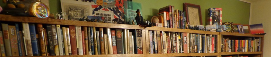
My mom is a quilter (those are her quilts pictured above), but she couldn’t attend the show with me this year. It was weird because even though I can appreciate the quilts and what it takes to make them, I have no idea what half of the patterns or techniques are that are displayed. The pictures that follow are quilts that caught my eye for one reason or another, and again I forgot to charge my camera battery so I didn’t get a LOT of the show recorded. Are you ready to go?

Quilt #1 – Rose Pinwheels
I have no idea if this pattern is pinwheels or monkey wrenches, or whatever else you might want to call it. They look like pinwheels to me, so that’s what I’m calling it. If you know me well enough then you instantly realized why this one caught my attention.
ROSES!
Also, that border is very busy, but mostly the roses.
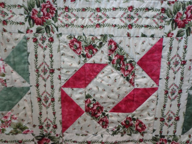
It was like the Biltmore Rose garden in fabric!

Quilt #2 – Contemporary Victorian
Yes, and more roses! This quilt at first reminds me of a delicate china saucer, but yet it has a very modern, geometric edge to it. It’s very soft and pastel-like. I feel like I should be sipping tea and eating biscuits while contemplating this piece.

I really liked the soft edges of the feather design, which follows the scallop border, meeting up with the crisp edges of the hash quilting. I’m not much of a pink person, but I liked this one.

Quilt #3 – Land of the Free
There were quite a few patriotic quilts there, which I enjoy. Perhaps it’s because my birthday is on Flag Day, but I love the celebration of who we are done in fabric. Many quilters use their hobby to donate these quilts to charities such as Quilts of Valor. What better way to show comfort and care to a member of our military, whether active or a veteran, than with a warm quilt that they can wrap themselves in?
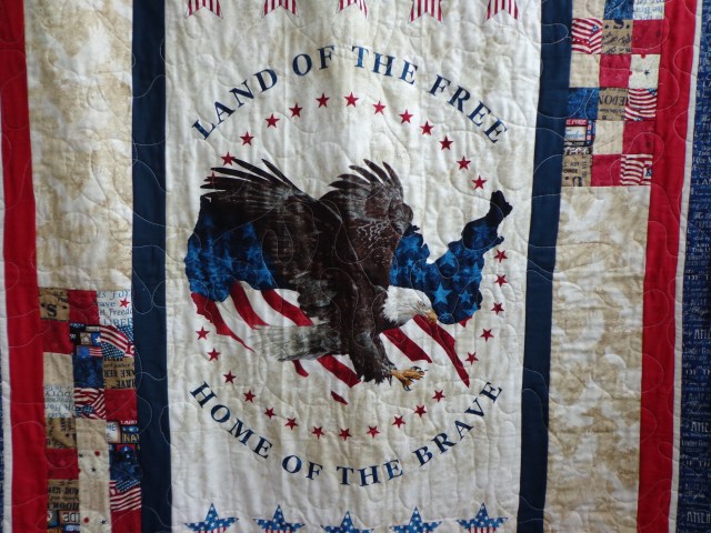
There were quite a few quilts this year that used a panel as the middle of the quilt, like this one. The only thing that I didn’t like about this quilt was I felt the actual quilting took away from the design. I’m not sure how you would quilt it, but the white lines running through the eagle’s wings is distracting.
One other thing about this quilt was the backing had been made using pictures of the quilter’s family members who had served. I didn’t take a picture as I didn’t want to post their pictures all over, but I thought it was a nice touch.
As I finished looking at this quilt I turned and was met with this sight:

Quilt #4 – Blinded by the Poppies
This picture is washed out due to the sun streaming in behind the quilt, but believe me when I say that this quilt was BRIGHT! All of those vibrant oranges and yellows really screamed. It looked like something my mom would like. Not to make, but those reds and yellows are the colors she likes to wear. Maybe for Christmas I can find some of that poppy material and make her a pair of pants…

And sitting next to this LOUD quilt was one that made me do a double take…

Quilt #5 – Quilting Love
At first (quick) glance it looks like any other quilt. Until you notice that the middle of the squares have sayings instead of a pattern. Of course, I had to stand there and read them all. Here are a few of my favorites:


Hopefully you had at least one chuckle. There were a few other quilts at the show that used this same idea of squares with sayings, but this one was my favorite.

Quilt #6 – Blue Lagoon
Blue was a very popular color this year. For me that was great because blue is my favorite color. This quilt is another one of those kaleidoscope quilts where you take the same piece of fabric and cut it up differently to make your various squares.

I don’t feel that I’m very artistic, so I always marvel at just how different these squares can look despite they are all using the same fabric!

Quilt #7 – Flowery Stars
Here’s another kaleidoscope quilt. I told you that they fascinate me. I could stand and stare at them for hours.

I really liked the colors in this one, too.

Quilt #8 – No Boundaries
When I first looked at this I thought, “Okay, a traditional quilt.” Then I stopped because there was actually something different about it. There’s no border! There’s no decorative edge. It doesn’t even make another design when you stand back and look at it. All at once it looks both vintage and contemporary. Not my taste, but very neat.

Quilt #9 – Rose Stunner
Again, I’m not a red person, but I am a rose person. And I thought this was gorgeous. When I read the tag it said that it was actually a kit, but it had been a challenge for the woman who had quilted it.

Looking close you can see that the shading was dyed into the fabric, so it wasn’t pieced to get the shading. Either way, it’s a beautiful piece.

Quilt #10 – Contemporary Tumbling Blocks
At least, I think this is a tumbling block pattern. It’s pretty and the quilter did a good job, but I almost walked past it before I noticed what else she had done…

She had sewn crystals in all of the blocks! Sparkle makes almost everything better.

Quilted Wall Hangings
I took a picture of this display because it brought to mind elementary art class. Do you remember those black pieces of paper that the art teacher would hand out with an etching utensil? As you etched on the paper the color below would show through and they were often very bright colors and patterns. That’s what these wall hangings brought to mind.

Quilt #11 – In the Pale
Here’s yet another traditional quilt with a contemporary twist. If you watch home improvement shows you know that they paint a lot of rooms gray. Or white. Or both. Right now it’s very popular to have either white or gray subway tile in your house. Not in mine, but in some. Well, I can see that if you’re related to a person who HAS to have that kind of look they might actually like this quilt. It’s traditional without looking like you just took it off of grandma’s bed.
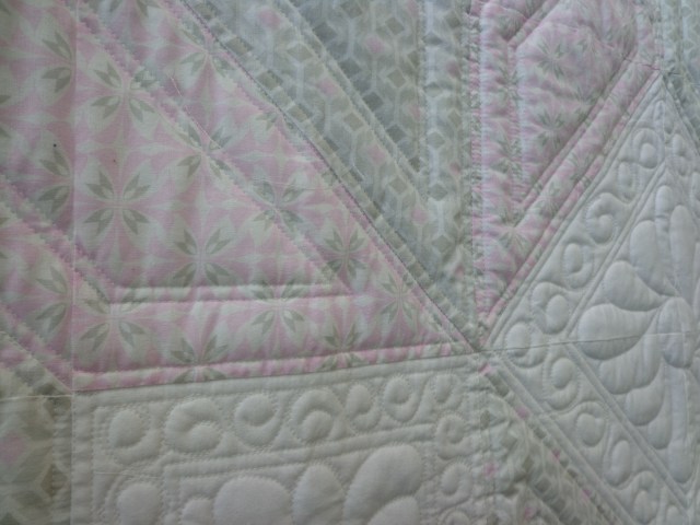
At the very least this quilt should be appreciated for all of the detailed quilting that was done to it. It probably took five times longer to do the quilting than it did to sew the top together!

Quilt #12 – Get Your Motor Running
This is a good example of how not every quilt has to be feminine, flowery or boring. In fact, one of the things that made me chuckle about this quilt was the design used for the quilting:

Can you see it? Do you recognize it? They are motorcycles!

Quilt #13 – What?
To be completely honest I’m not sure why I took a picture of this one. Since it was on my camera, though, you’re going to look at it, too. LOOK AT IT! APPRECIATE IT.
Let’s move on…

Quilt #14 – Droof
Again, the light is washing out the picture, but it’s PURPLE. Lots of purple. That’s why I’m calling this one, “Droof.” She would love this quilt!

Quilt #15 – Scrappy Cartwheels
My mom loves making scrap quilts. I imagine that the woman who made this one does, too. Or else she inherited a giant box of scraps and couldn’t bring herself to throw it out. I’m not sure what the pattern is called, but it reminds me of somebody doing cartwheels. I can’t do cartwheels or quilt, so this one definitely wasn’t made for me.

Quilt #16 – Negative Double Wedding Ring
When I use the word ‘negative’ I mean like a photograph negative where the dark is light and the light is dark. Usually you see a double wedding ring quilt with the light insides and darker rings, but this one just had to be different. I’m not really a fan, either.

Quilt #17 – Grandpa
The colors should be better on all of the pictures from this point forward because I’ve finally made it out of the entrance hall and into the actual room. This quilt reminds me of my grandpa. He always wore old jeans so they were usually a very faded blue, and then he wore some kind of printed or plaid button-up shirt.

Quilt #18 – Sand Dunes
I told you that there was a lot of blue at the show this year. I’ve recently discovered that I really like this color pallet: tans/beige and blues. This reminds me of being on a beach as the tide is receding. If you think I’m crazy because it doesn’t look anything like that please keep in mind that the last time I was on an ocean beach was 1995. So this is the fuzzy version of my beach. hehehe

When inspecting this quilt I noticed that the same technique was used that my mom has used on a few of her quilts. Again, another scrap quilt.

Quilt #19 – Florida Style
Flamingos always remind me of Florida. I’m not a fan, but this one caught my eye because it had sparklies on it. It was made by a member of a crazy quilt club and they are more of fiber artists who like to do the fiddly things. Like cutting fabric appliques in such a way that it actually gives the flamingo the look of having feathers…


Quilt #20 – Embroidered Denim
My mom has made one of these. Actually, if you wanted a quilt to have on hand for picnics or tossing on the ground just to look up at the stars this would be perfect. After all, denim is tough and it washes up pretty good.

Quilt #21 – Flannel Fuzzy
This was another thing that I saw at the show: flannel. It was all over. The one thing about flannel, though, is that it works beautifully for the chenille technique.


Quilt #22 – Strutting Around
This quilt was cute. Little chickens and material that looked like burlap.

Then I looked at the border…

Chickens!

Quilt #23 – Wide Awake
I decided that I wouldn’t be able to sleep under this quilt. The fabric is just way too busy for my tastes. Then when you look up close there’s a LOT of quilting. Sometimes less is more. Just sayin’…

Quilt #24 – Grandma’s Apron
These are definitely vintage pieces of fabric. In fact, I think that my grandma had a few aprons made out of these patterns.


Quilt #25 – ?
Another one that I’m not sure why I took the picture. Especially considering the fact that my battery is starting to fade. It’s okay, I guess. Maybe Babe will get more out of this picture than I did.

Quilt #26 – Stars Get In My Eyes
When I spotted this and saw the fabric I thought, “Is that what I think it is?”

And it was! Squares made of celestial fabric! How beautiful!

Quilt #27 – Iced Candy
Here is a good example of how you can use a fabric that has a busy pattern and soften it a bit. Isn’t this pretty?

Quilt #28 – Swedish Stained Glass
For some reason my mom really likes yellow quilts. When I saw this I thought she should see it, too. As I looked at it from across the way I thought how much it looked like stained glass in the colors of the Swedish flag. It looked a bit different in person, but it was pretty.

It delighted me to discover that the fabric actually looked like stained glass up close. No wonder I thought it looked like that from afar. I’m not a yellow person, but I would put this quilt on my bed.
And then my camera battery died. So I walked around the vendors’ booths to see if I could find anything for my mom. Is it bad that I found something… for her to make me?
It’s called ‘Because of the Cross’

This pattern was designed by a person who is actually local. To be fair, if I had only seen it like the picture on the pattern I wouldn’t have taken a second look at it. When I saw this hanging, though, I couldn’t look away:
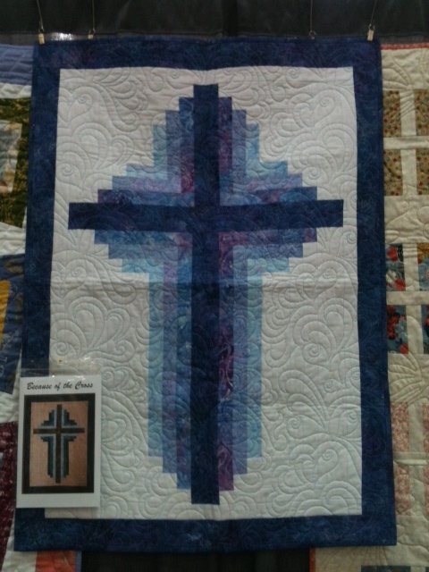
The picture doesn’t do it justice. It was stunning in person. This colorway just made it look like the cross was radiating light. I know that I can be hard to buy for at Christmas so I thought I would help my mom out in that respect. She has a great eye for color so I know that she can make one for me just as gorgeous as this example.
So, that’s it. You’ve made it through the zillion pictures. Congratulations!

Bear, Quilt #18 is a Bonnie Hunter design and #21 They call it a rag quilt. Mom.
Pingback: 2019 Quilt Show – Part 2 | Kerry'd Away